Mocast
For the past couple months, I have been working on a top secret project that aims to redefine the way work will get done, address key industry mobility challenges and spark true mobile-led business change. I’m just kidding, it’s a podcast player!
Why?
Mocast is not going to redefine how work gets done, but I am hoping it redefines how you listen to podcasts.
I wrote Mocast because I was unhappy with the iOS podcast app selection. While there are almost as many iPhone podcast players as there are weather apps, I find that they all have two fatal flaws.
First, they take downloads way too seriously. Most UIs differentiate downloaded vs. not downloaded episodes and bifurcate their interface along those lines. This is silly to us podcastistas who aren’t the greatest at planning ahead.
Second, they take new episodes too seriously. Whole apps seem built with only new episodes in mind as they hide away the back catalog. I don’t know why this is. My favorite podcast, The Incomparable has an amazingly rich back catalog of episodes that I love to listen to. It’s nice when a new episode arrives but there’s no need over-emphasize them at the cost of the full catalog.
How?
First, and most importantly, downloads are completely** optional** when using Mocast. You can always play an episode immediately, whether you have downloaded it or not thanks to streaming.
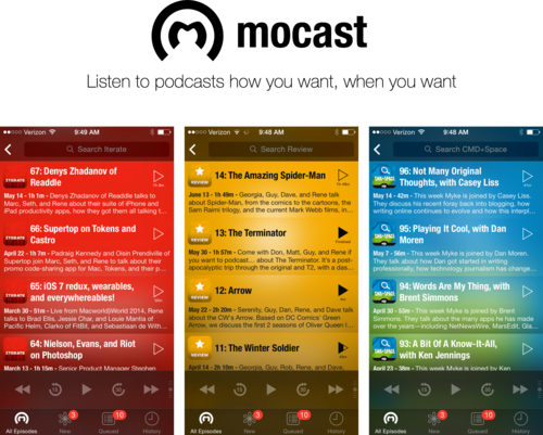
Next, it’s a single-screen thumb-based UI. You see, I walk a lot in parks and can’t stand apps that have a complex navigation history with back buttons with crazy nesting - I need to be able to do everything with my thumb and I need the screen to be predictable. Mocast makes that possible. You will only ever see a list of episodes, a search box, and play controls. There is no Now Playing screen, no episode screens, just episodes and a big play button. I even tried to limit the number of buttons all together. This is a slide-happy, thumb loving app.
Mocast puts you in control with queues. Mocast presents four different lists of episodes: Per-podcast, New, Queued, and History. While Mocast manages most of those lists, The Queue is fully under your control. You can add episodes to listen to later or setup a nice set of old favorites to listen to when nothing new is coming in.
Mocast acknowledges and embraces our busy lives that prevent us from completing episodes. It keeps a running History of past played episodes (and of course where you left off) so that you can jump around between episodes without ever worrying about forgetting to finish one.
Lastly, and this is one of my favorite features, Mocast lets you perform offline full-text searches of all episodes’ show notes. Do you want to see all podcasts that mentioned WWDC 2014? Easy. How about all Star Wars episodes? Done. Every list Mocast shows is searchable and the search box is always ready for you at the top of the app.
A bit of fun
While I truly believe Mocast has a lot to offer in terms of usability, I think it’s a fun app too. Here are a few of my favorite features.
Siri is used to announce episodes. Yes, that Siri. It took some string pulling and I have to deal with a 150 page rider, but she’s there to let you know what you’re listening to.
The time scrubber is thumb friendly, velocity controlled, big and bold. I can’t stand apps with tiny scrubbers so I hope you will enjoy this one.
Dark disco theme that adapts to your episodes. Mocast is just a sad dark gray app until you start adding podcasts. But once they’re in, it lights up with their colors and keeps those colors moving around. It’s hard to describe in words, so I hope you’ll risk the $3 to see for yourself.
There are more features than this tucked away! I hope you’ll check them out!
Colophon
As with all my apps, I wrote Mocast in C# using Xamarin.iOS. She came out to be about 8,000 loc with about 60% of that code lying in the UI layer.
